A Review Of Kodak Portra 160 Film
The beauty of Kodak Portra 160 however, is in its restraint. If you want your color work to stand the test of time, this is undoubtedly the color negative film stock to use.


Decaf Journal is reader-supported. When you buy links through our site, we may earn an affiliate commission.
Many analog photographers will tell you that the one of the best parts of shooting film is the inherent delayed gratification that comes along with it. There's latency from the moment the image is taken to when it is finally seen hours, days, or even weeks later after being developed. This mandatory wait time creates a feeling reminiscent of a young child on Christmas morning when the photographs are finally seen for the first time.
Sometimes the results are even better than you could've imagined, and film photography does that for many people. It isn't just the aesthetic, it's the discipline that comes along with it.
Then there's the specific look that each individual film stock provides. Perhaps the greatest director of our time, Christopher Nolan has been quoted as saying that film is the closest representation to what the human eye sees, and Kodak Portra 160 is a perfect example of this. It feels real, true to life, and renders moments in time just as you might remember them.
You'd be hard pressed to choose a more ideal balances of colors and contrast even if you tried. Everything just looks right. It's the film stock that you can document your entire life on, and is the desert island film that I'd choose if I could only have one.
Kodak Portra 160 is a color negative film with a sensitivity of ISO 160. This means that it is a fine grained, low contrast film which is not very sensitive to light, and is best used before the sun goes down or in a studio environment with flash. This film stock adds warmth and a bit of magenta to skin tones. It is more balanced towards oranges, reds, and yellows in general, but it also does something quite pleasing to greens as well.
The film's look can vary considerably depending on the scanner being used in order to digitize the negatives. The legendary Fuji Frontier scanners tend to add saturation and contrast, while Noritsu scanners render a flatter, more muted image. Silverfast scanner software (unintuitive to use but great results) for consumer use also produces an image similar to Noritsu, and it's my personal preferred interpretation of Kodak Portra 160.
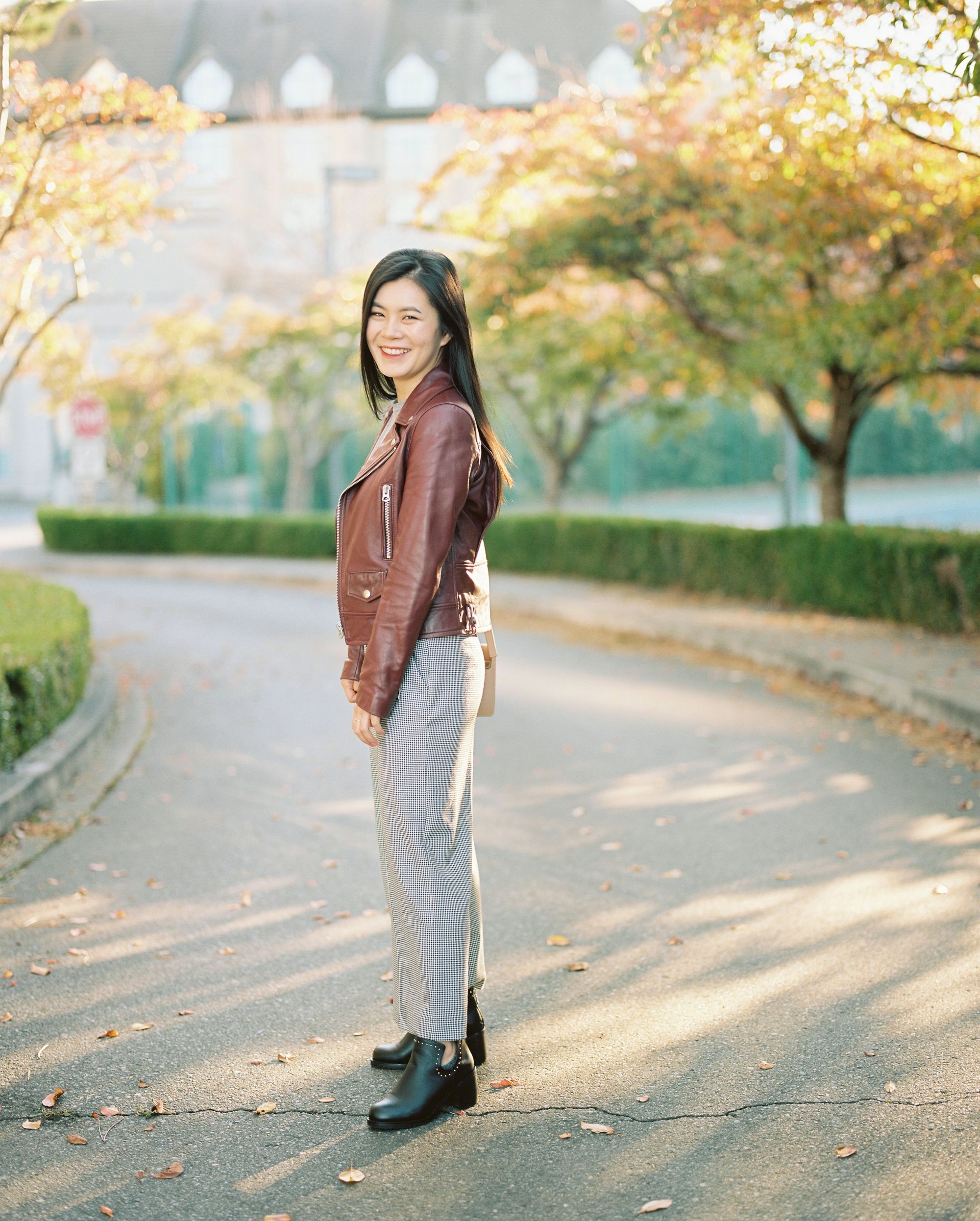

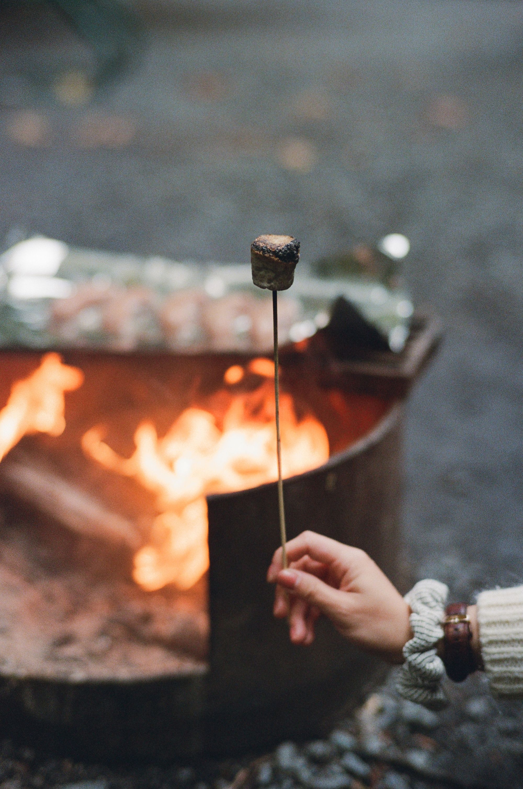
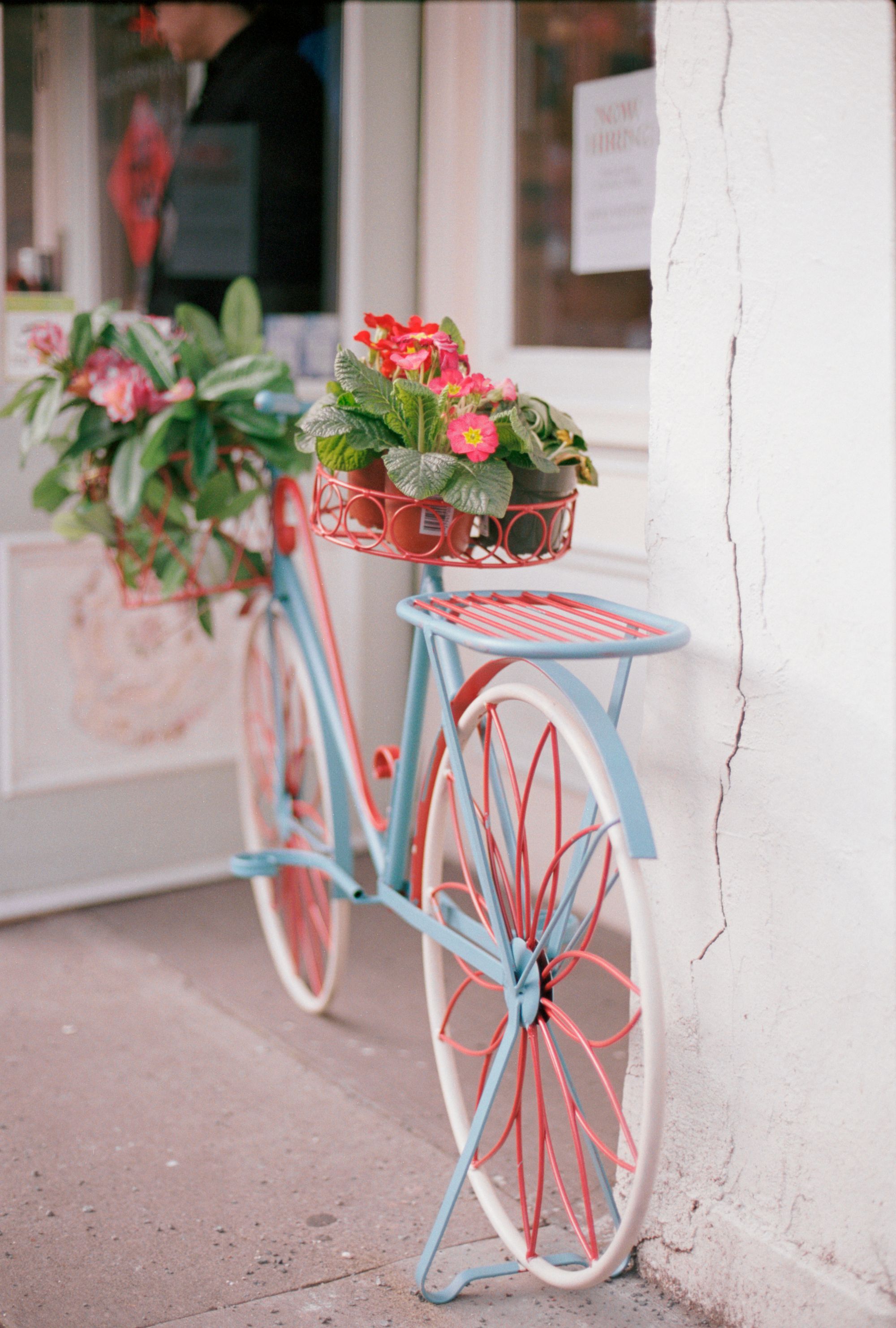
© Nicklaus Walter | Film: Kodak Portra 160 | Camera: Mamiya RZ67 Pro ii | Lens: 110mm 2.8
Color negative film generally performs best when overexposed. Kodak Portra 160 is optimal when shot at ISO 100, which is overexposed by two thirds of a stop. This will give the film plenty of detail in the shadows while also protecting the highlights from any loss of detail. This color negative film retains highlights quite well, and while it's difficult to lose highlight detail entirely, it's not impossible.
Even when bright details are lost, the highlight roll off looks much more pleasing and organic than when a digital file loses highlight detail. Alternatively, the film can be rated and shot at ISO 320 and later pushed one stop in development in order to give the film more contrast and an overall darker look. It's definitely a different vibe, but it looks incredible when done correctly.
Subjectively speaking, Kodak Portra 160 features the perfect color palette for skin tones of all types, as well as food and still life subjects. Given that colors are tastefully muted, the film lends itself well to portraiture, fashion photography, and is an excellent choice for studio portraits.
In fact, my favorite photographer of all time, Norman Jean Roy always used Portra 160 on his shoots. The film stock also offers a perfect base look for when you wish to add color to the image afterwards in post production, such as adding cyan to the shadows or orange to the highlights. Norman often did this with his editorial work, and he did it well. The skin tones remain tasteful, but you can selectively add a punch of saturation to other areas of the image.
While there's plenty to love about Kodak Portra 160, it isn't appropriate for all situations. Broadly speaking, it isn't ideal for vivid landscapes, beaches, or anything else where you'd expect colors to pop. Too much saturation and color is lost with Portra 160. Kodak Ektar or Fuji Velvia are better choices in these contexts. In Portra 160's favor, it does look incredible in the autumn season with various colored leaves on trees.
It's also not the best general use travel film either since colors can be too muted, making the adventure of a lifetime appear somewhat underwhelming. It should also be noted that Portra 160 can't be used in low light conditions without the use of flash.
While not as versatile as Kodak Portra 400 since it doesn't have endless highlight detail retention, the color palette of Portra 160 is more elegant and more tasteful. Portra 400 is likely the more popular film due to it's swiss army knife nature in that it can be used in almost any light and the colors are universally appealing.
The beauty of Kodak Portra 160 however, is in its restraint. If you want your color work to stand the test of time, this is undoubtedly the color negative film stock to use.
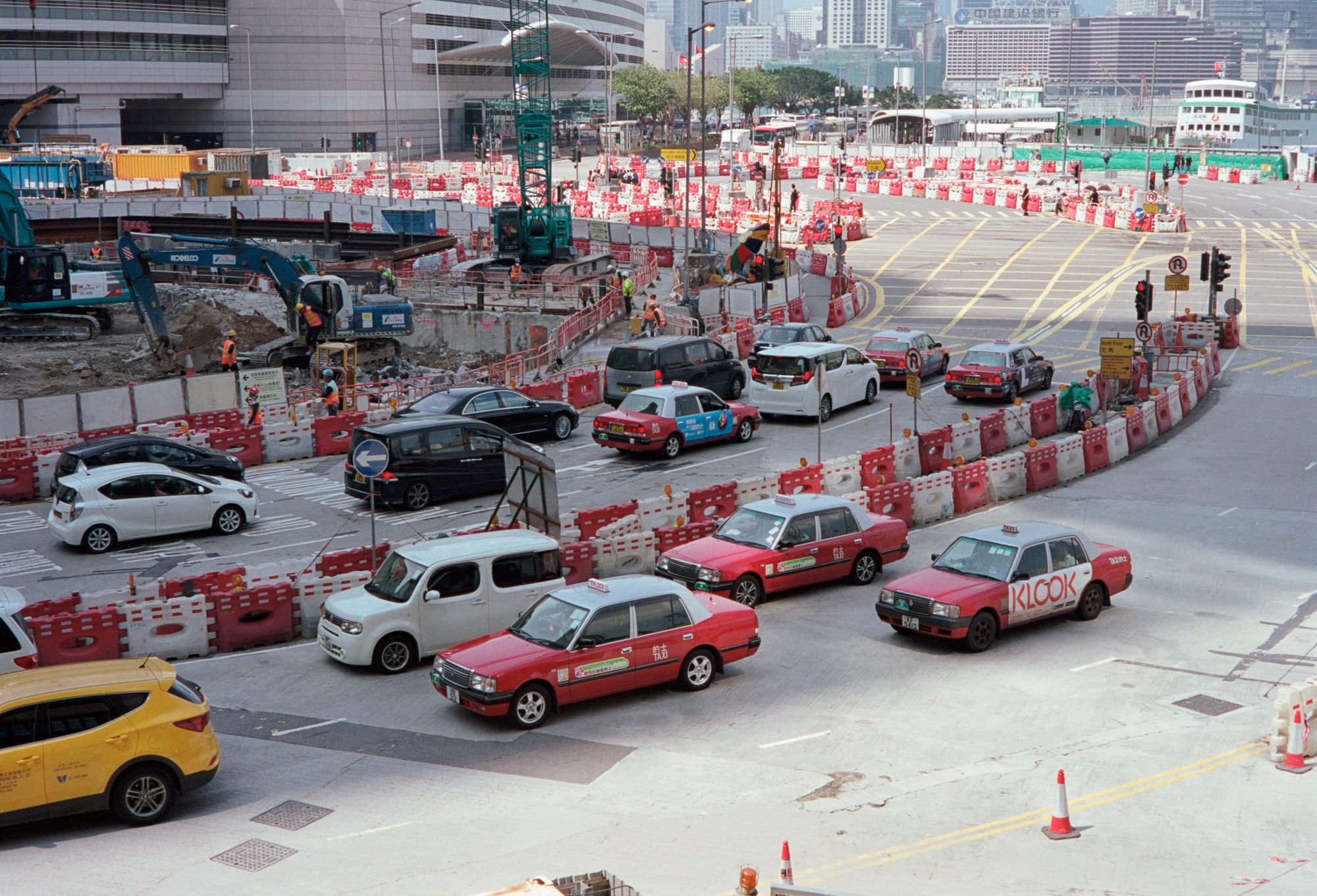
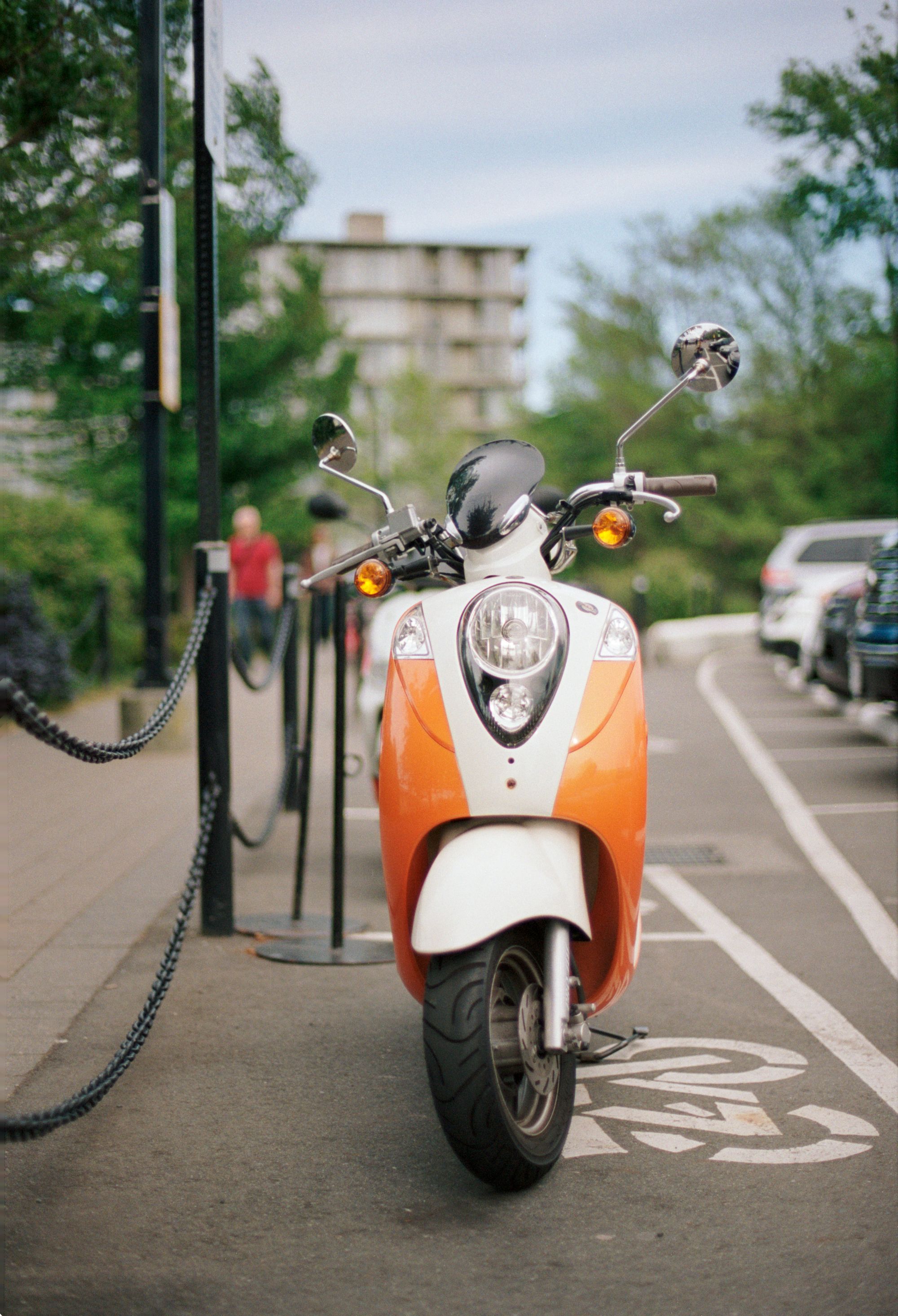
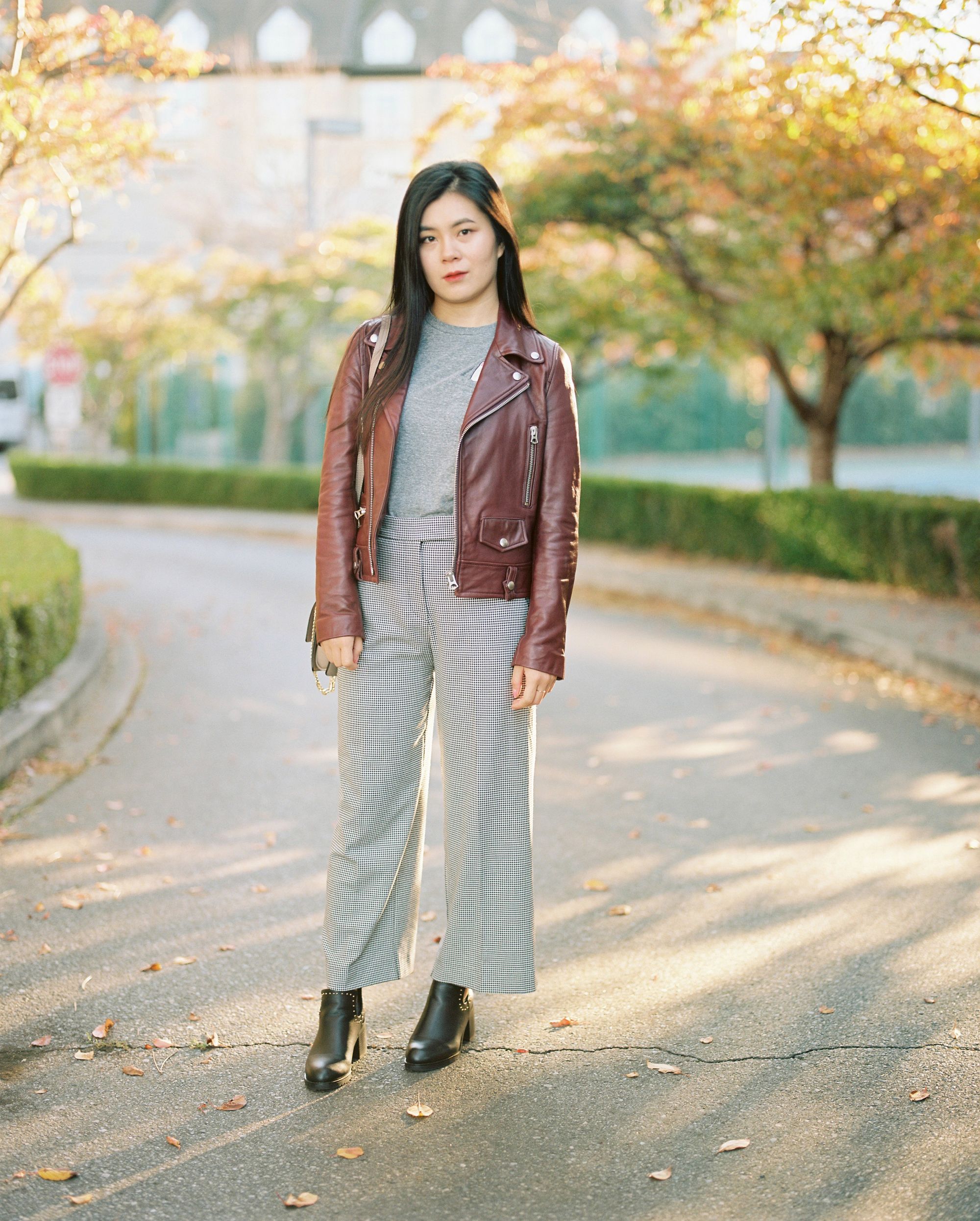
© Nicklaus Walter | Film: Kodak Portra 160 | Camera: Canon EOS 3 | Lens: Canon EF 50mm f/1.4 USM
This wouldn't be an honest article about film photography if I didn't comment on the elephant in the room. The price of analog film has increased dramatically in recent years, and Portra 160 is no exception. It is literally double the price now from when I was shooting it daily only a few short years ago.
It was never "cheap", but Kodak Portra 160 used to be what I consider reasonably priced for it provides in return. This is unfortunately one of my chief complaints about film now. It has become a luxury item and can end up costing you a nontrivial amount of money if care isn't taken. You've been warned.
So who is this film stock for? Kodak Portra 160 is at it's best when photographing people or food and you want the images to have a subtle high end look without the film drawing attention to itself. Available today in a variety of sizes from 35mm, medium format, 4 x5, and even 8 x 10 large format, it looks great no matter the film size.
I've personally shot this film extensively on 35mm and medium format. 35mm film is inherently grainier and holds less detail, but it's always beautiful and feels raw. The medium format version on the other hand, has enhanced tonality of highlights and shadows which is ideal for fashion photography.
I don't have much time or money for film photography currently, but I long for the day when I can get back to blissfully shooting Kodak Portra 160 again. It will certainly make the prospect of getting older a little bit brighter to have life's special moments documented in such a beautiful way.