A Review Of The Classic Presets For Capture One
I must confess that I even stopped using Fujifilm's legendary film simulations in favor of The Classic Presets. Fujifilm's offering has its own beauty and appeal, but these presets seem more accurate to me based on past experience with film.

Decaf Journal is reader-supported. When you buy links through our site, we may earn an affiliate commission.
The advent of digital photography has largely been a gift for artists looking to push their creativity to its limits without the constraints that are inherent to analog film. With digital, feedback is instant, resolution is overabundant, and there isn't a price tag associated with every press of the shutter. These are wonderful features that many of us can no longer live without.
There is one aspect of analog film however, that arguably still reigns supreme. The way film renders has a classic look straight out of the box that can still be difficult to achieve with a digital camera, even for seasoned post production artists.
As someone who shot film frequently for a couple years before getting my first serious digital camera, you couldn't blame me for trying to find a way to recreate the timeless beauty of analog film with my digital images. For quite some time there were no real options besides messing with various tone curves and color channels in Photoshop. I tried that, and nearly went insane in the process.
Eventually though, presets from VSCO became available for Adobe Lightroom which was the first time I'd ever seen digital images look even vaguely similar to film. Though they first seemed like the perfect solution, ultimately they were way too heavy handed. VSCO presets were more or less unusable in studio environments or for any images with high contrast light.
They were best reserved for flat light or overcast days when you needed to add some punch to an image. The simulated grain was also too much, as clients at the stock photo company that I worked at were always requesting images to be reprocessed without the fake grain.
A few years later, Mastin Labs came on the scene with bright and airy presets that far more accurately reproduced the look of analog film. I remember the excitement that my colleagues and I felt upon seeing them for the first time. The only caveat here was that those presets were based on film scans solely from a Fuji Frontier, which is a very specific look.
It primarily caters to wedding and family portrait photographers, which is certainly not a bad thing. Although Mastin Labs was a breath of fresh air at the time, given that film can look quite different depending on the scanner that's being used to digitize the negatives, it is somewhat of a niche offering.
When I decided to make the permanent switch from Adobe Lightroom to Capture One back in 2020, it was somewhat of a relief to be done with the presets I had previously purchased. I appreciated the speed and ease of use, but I was tired of being locked into one specific look. More specifically, the bright and airy overexposed pastel look.
Don't get me wrong, it's great. But it isn't great all the time. Capture One's incredible color editor in particular is the main reason that I didn't miss presets. It was finally easy to get beautiful images the way I wanted them to look without much effort.
One day, I randomly stumbled across some stunning old Kodachrome scans and began longing for a way to emulate the outstanding but long since discontinued slide film. I started casually searching online for presets that had attempted to replicate Kodachrome, when I stumbled across some sample images from The Classic Presets. Truth be told, they were unlike anything I'd ever seen from a digital image before.
I even had to double check to make sure that it was in fact a preset and not the real thing. Image after image that was showcased to display the various film stocks on offer in the preset pack stopped me in my tracks. The images really did look like film to my eyes in most instances. Not only that, but they appeared to be based on more neutral scans (my preference) in terms of color and contrast rather than the bold Fuji Frontier look.
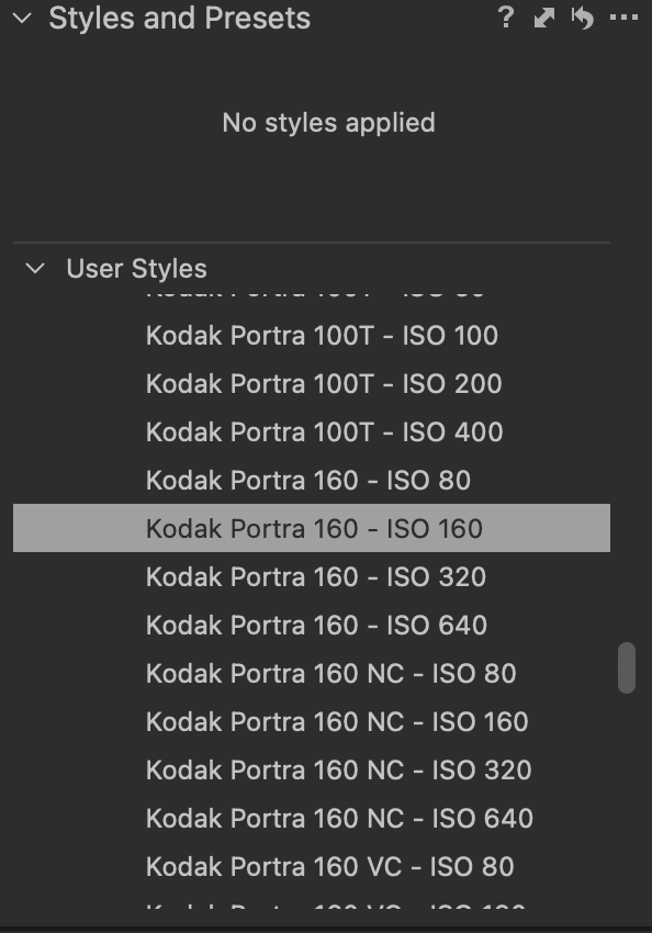
It didn't take long for me to pull the trigger on the Classic Film Style Collection for Capture One, and I use them for nearly all of my personal work now. The preset pack includes 62 film looks including Kodak Portra 160, Fuji 400h, Kodak Ektachrome E100, Kodak Tri-X 400, and nearly every other film you can think of. In terms of how to use them, each film stock has several ISO variations for different looks that can be achieved.
For example, Portra 160 is available from ISO 80 all the way through ISO 640. Each different ISO variant can be applied with one click as shown below.
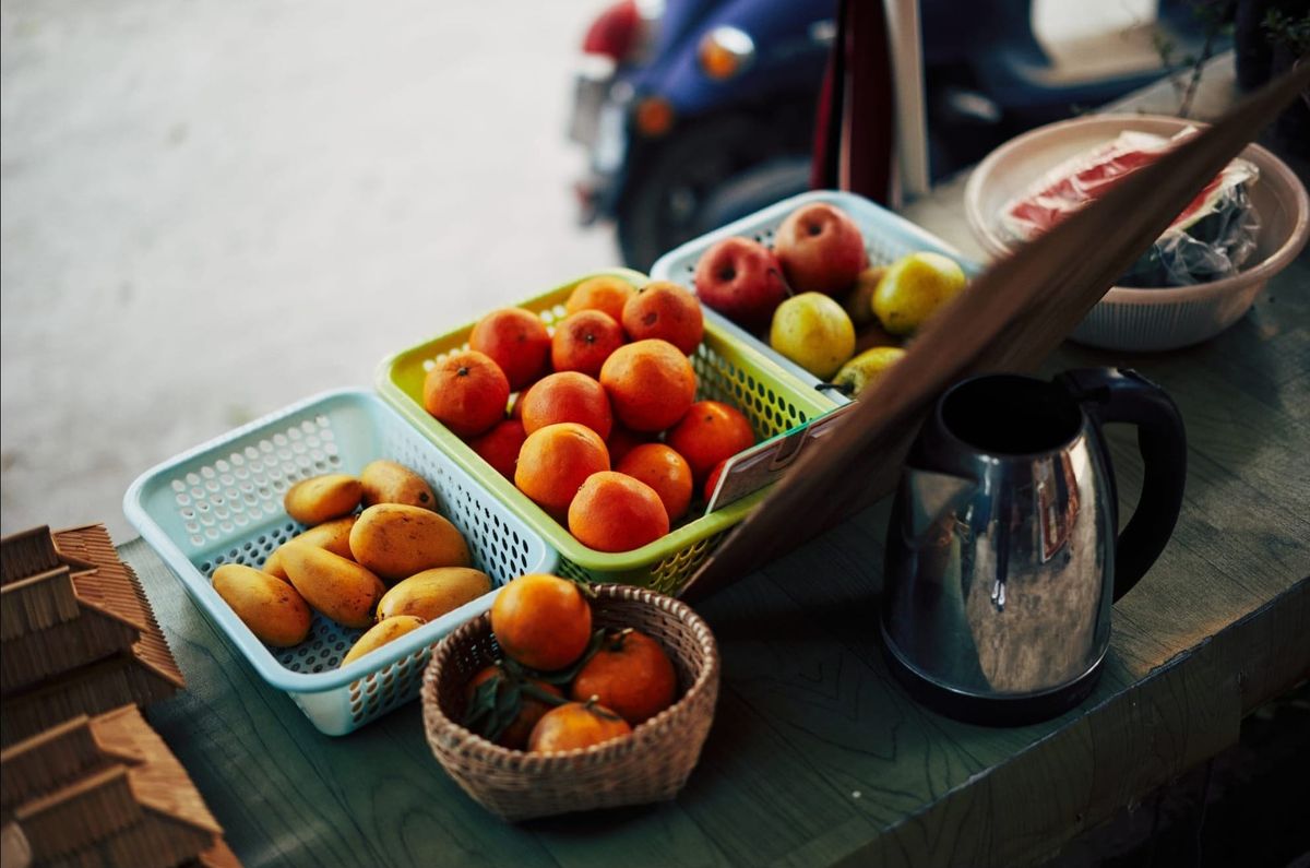
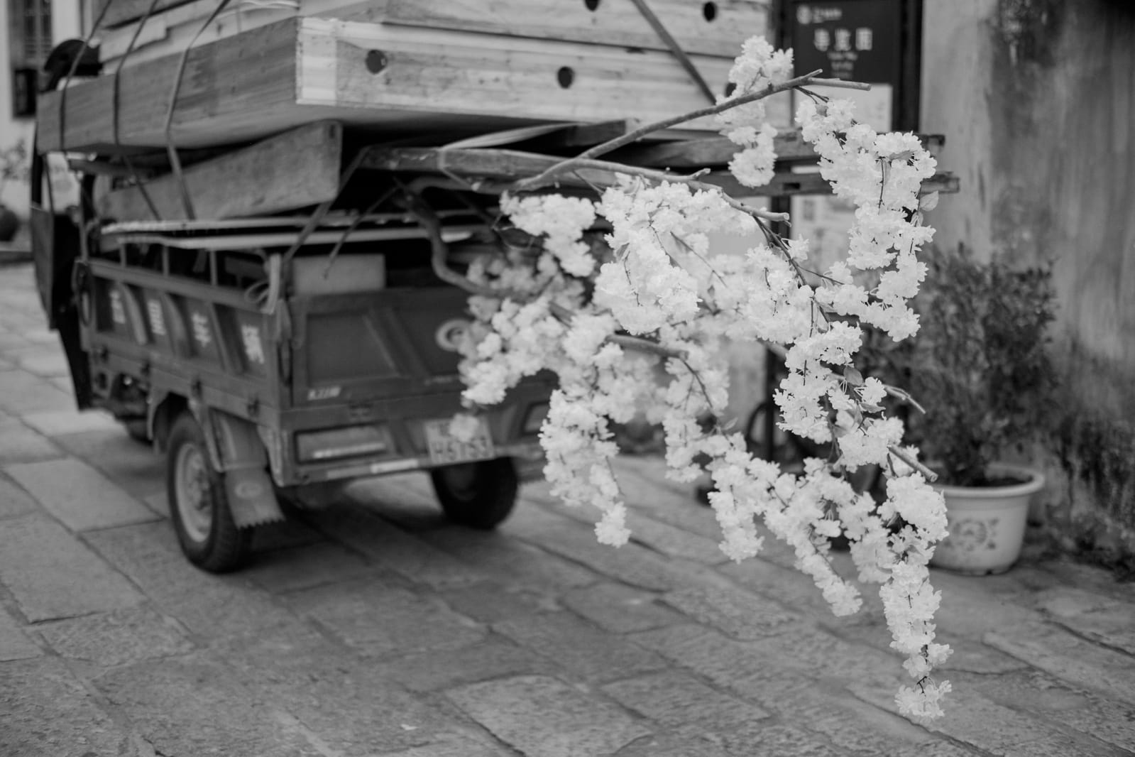
In practice, I've found that The Classic Presets aren't heavy handed in their rendition and are nondestructive. Thankfully, you can still easily manipulate your files further if you'd like. I shot film exclusively for a few years, and The Classic Presets really does look like film to my eyes on many occasions. I especially love its take on Fuji 400H, Kodak Portra 160, both Kodachrome variations, and Fuj Neopan 400 for black and white images.
That being said, I don't love some of the slide film offerings. Having not shot slide film in a while, I'm not sure if that's just how those films actually render with their limited dynamic range. Some of them are difficult to use however, unless applied to an image that primarily has flat light or low contrast in the scene.
There are some clear cut cases where I won't use The Classic Presets. I don't use them for my stock photography, as my agency prefers Capture One's excellent film standard profile. Understandably so, as clients of stock agencies tend to gravitate towards a slightly more commercial digital look. So it makes sense to keep the saleability of images high. Clients can always make their own color choices after the fact anyway with a neutral file as a starting point.
These presets generally aren't right for my studio portrait work either. When shooting in studio I also prefer to use Capture One's film standard profile and color editor, all while making my edits within that framework.
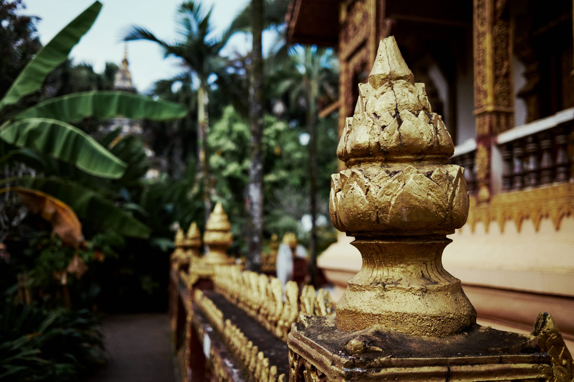
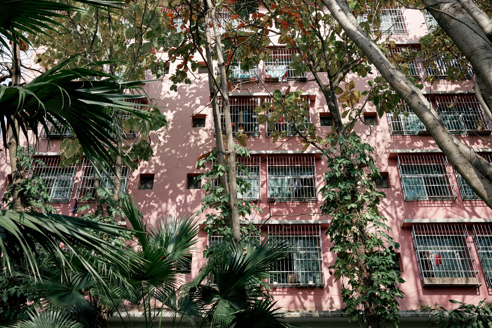
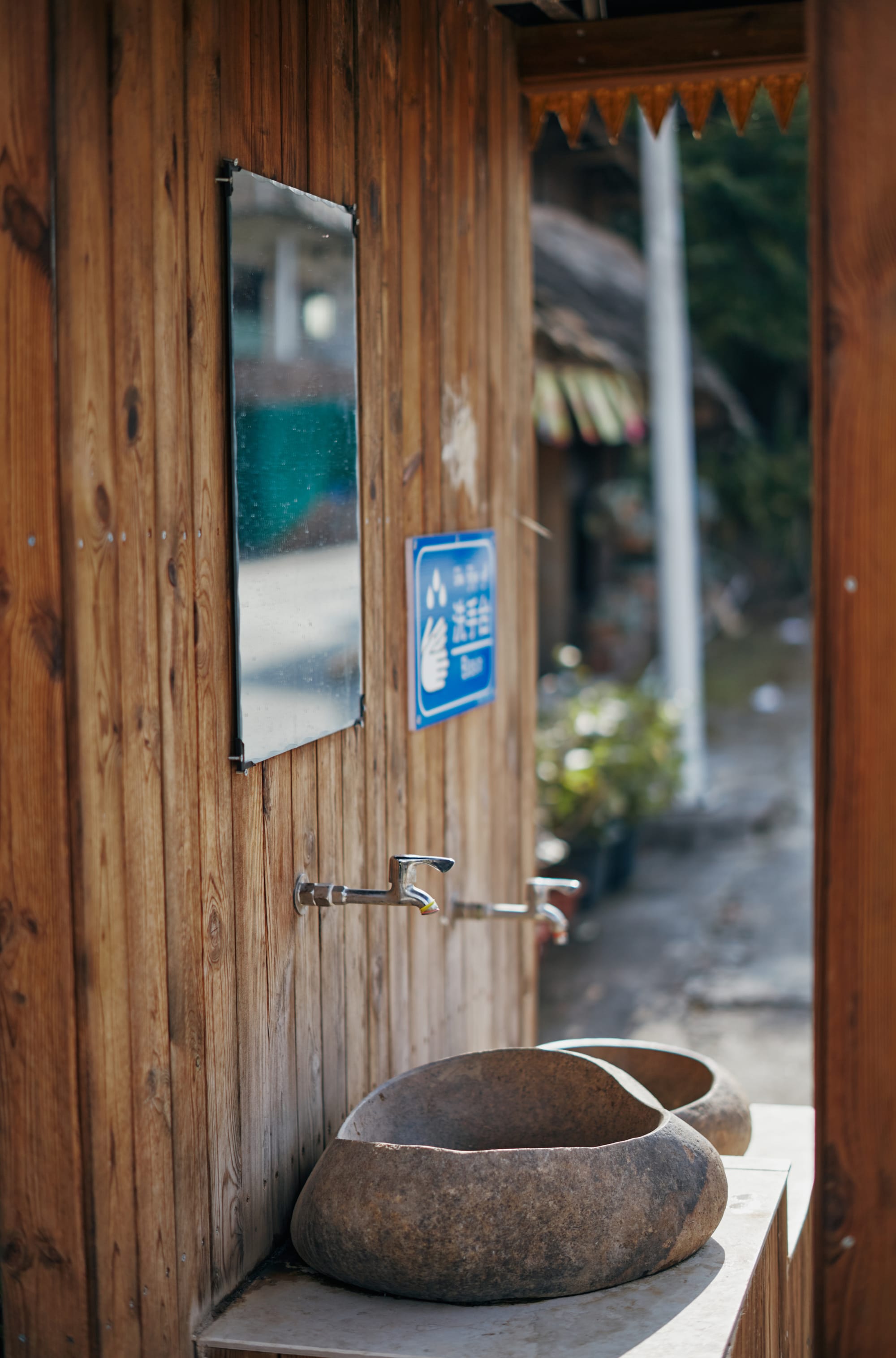
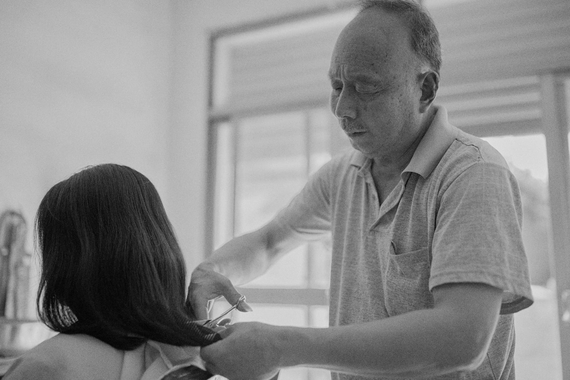
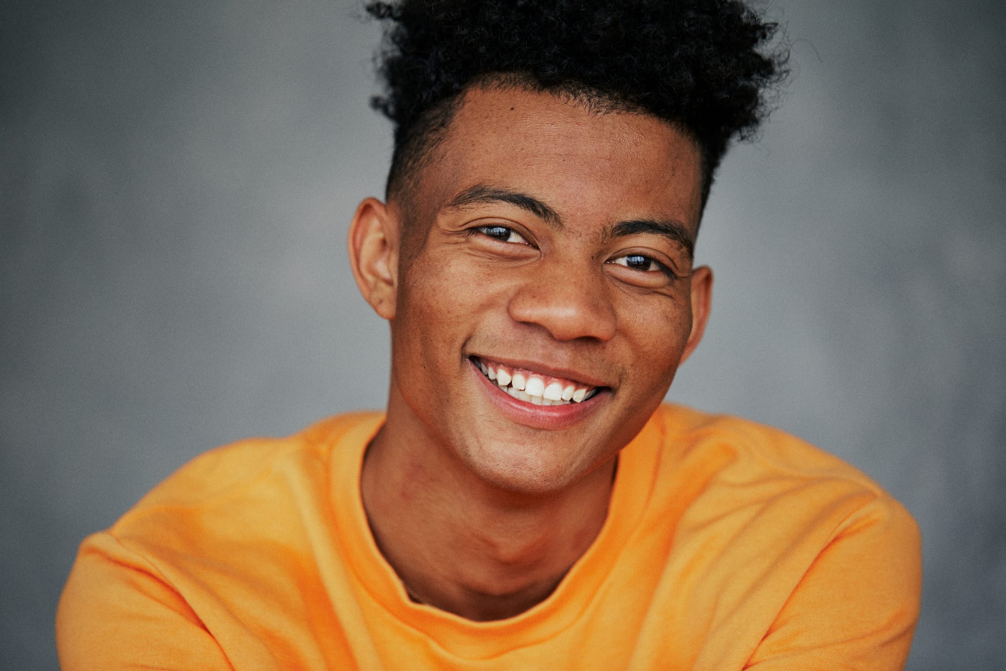
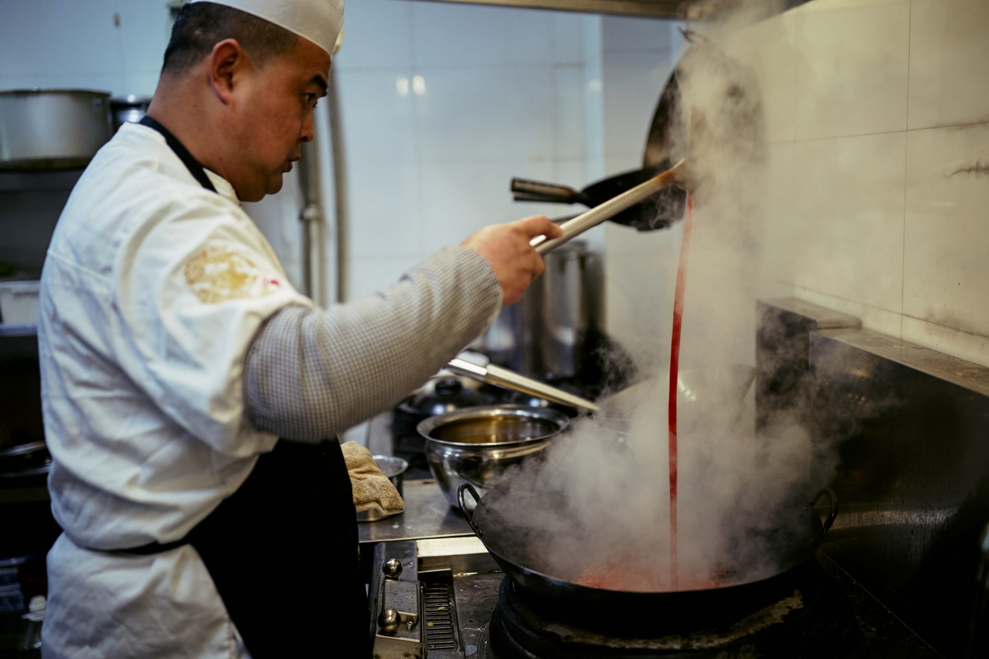
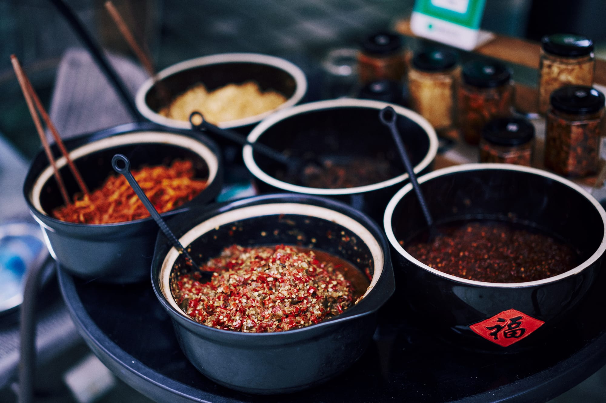
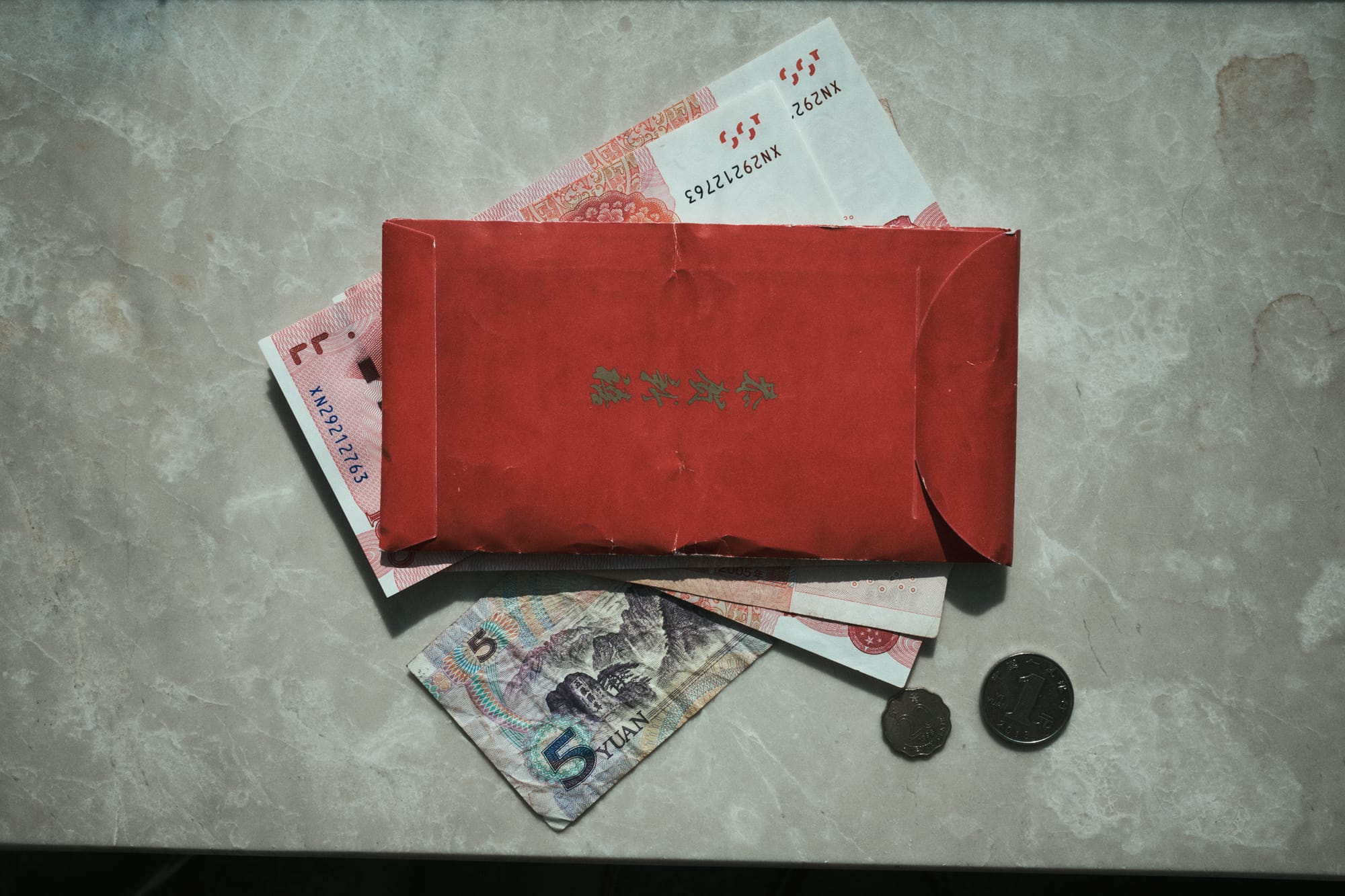
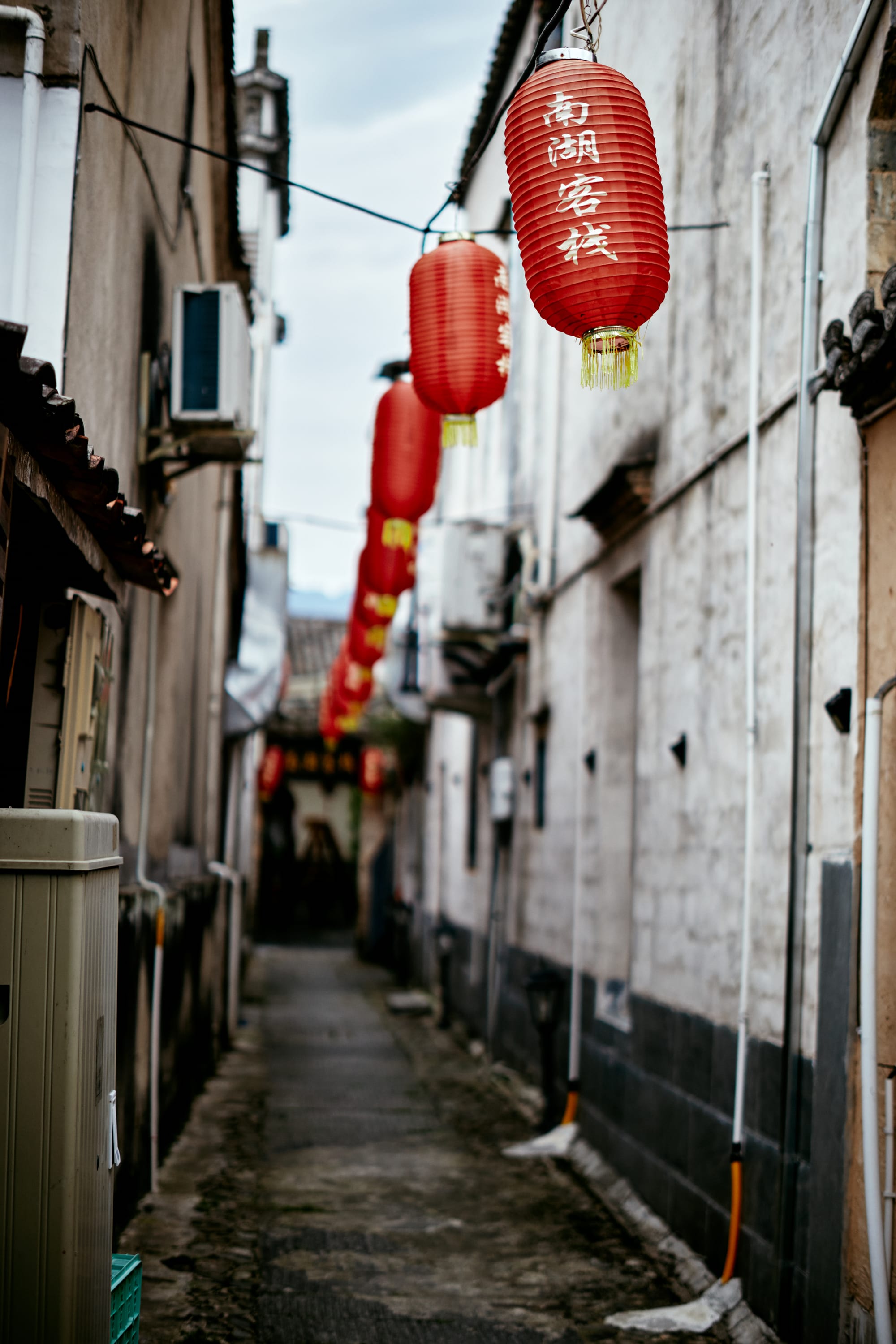
So who are The Classic Presets for, and on what occasion? These superb presets are best used when you want to inject an analog feel into a digital image, such as personal projects, travel photography, natural light portraits, fine art, food, etc.
For these situations I have been completely satisfied with its rendition. I must confess that I even stopped using Fujifilm's legendary film simulations in favor of The Classic Presets. Fujifilm's offering has its own beauty and appeal, but these presets seem more accurate to me based on past experience with film.
I don't always want my images to be clinically perfect, and for those instances The Classic Presets delivers. I now feel like I'm carrying a digital camera that secretly shoots film.
My recommendation is that you pair The Classic Presets with the vintage manual focus glass of your choice. No doubt it's a sublime experience for passionate photographers who long to add a sense of imperfect beauty in their work.
Update 12/12/2025: I recently started using Color Precision presets for Capture One, and I've found them to be the most color accurate presets in relation to real analog film that I've ever tested. They're now my top recommendation for anyone looking to get the film look with their digital images. Read my full review here.